2025 - Blue Chip Builds
Blue Chip Builds is a company based out of Raleigh, NC that focuses on providing the best home installation services in the Triangle. From door and window installation to restoration projects, Blue Chip Builds has completed over 2,000 projects while delivering award winning customer service.
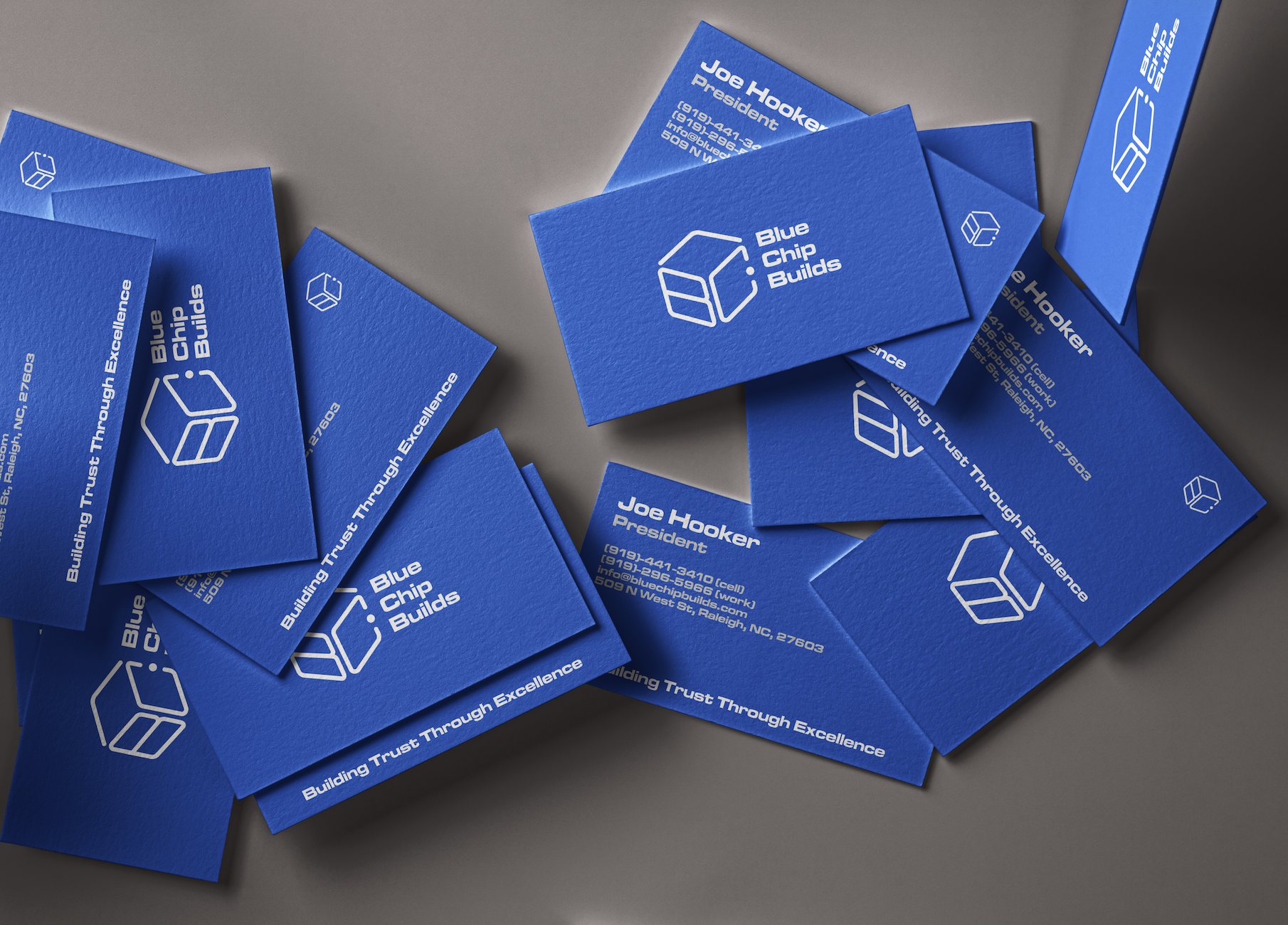
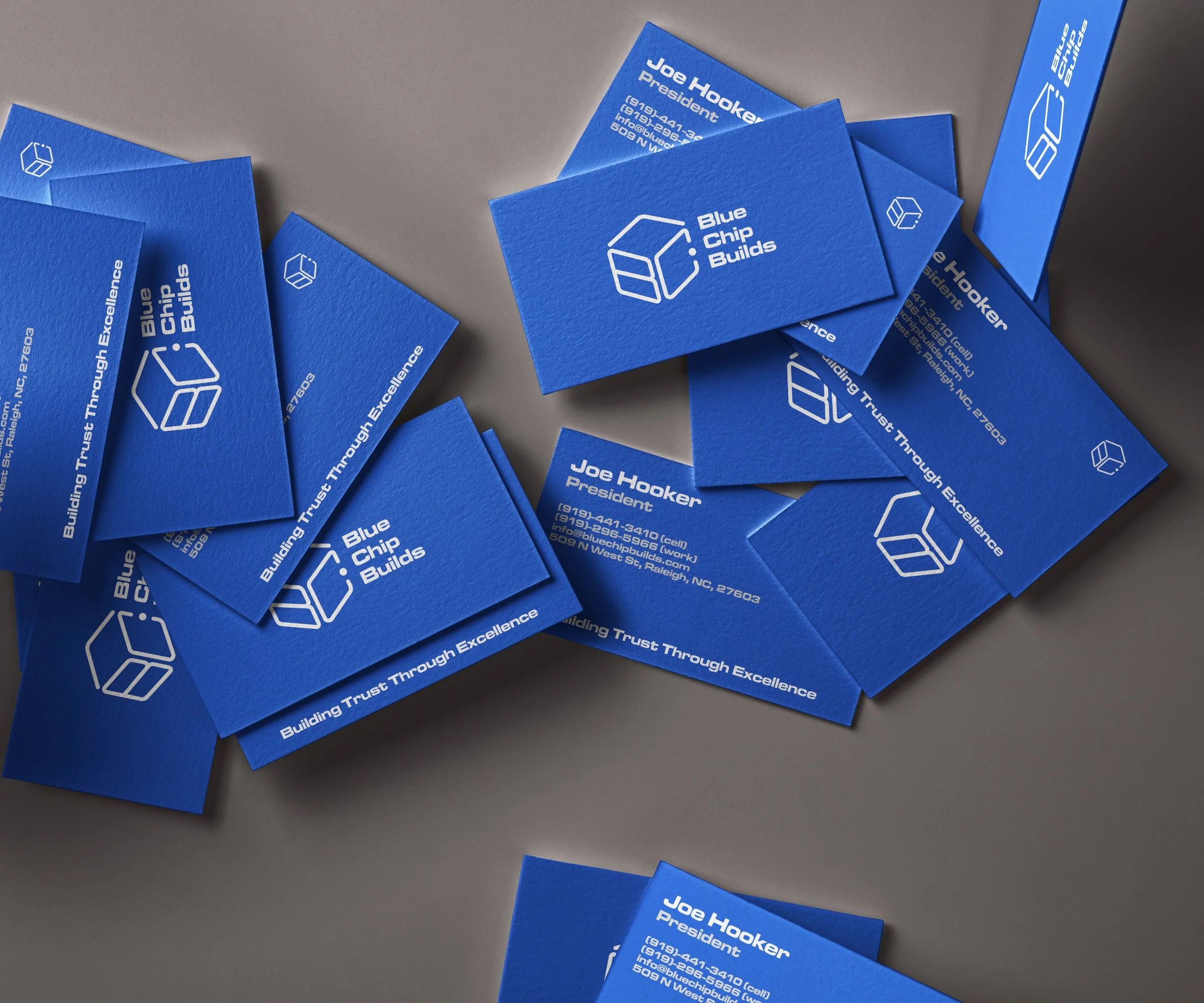
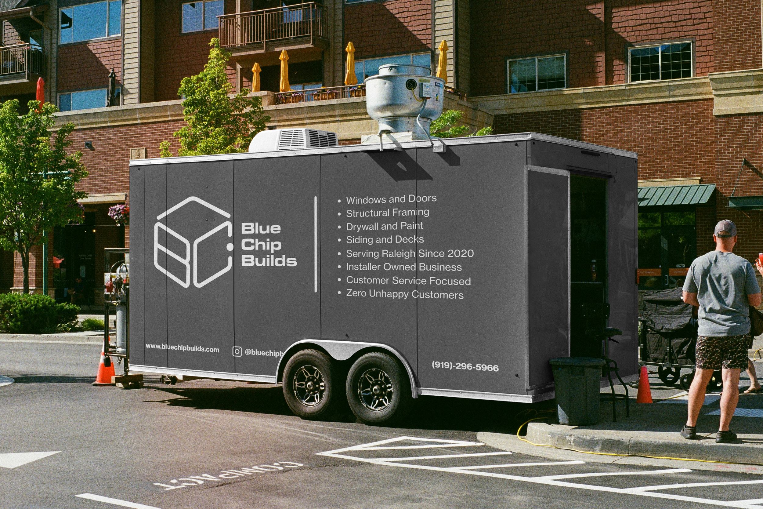
My objective as a designer for a few of their products included creating an updated logo, developing a color palette, and applying a cohesive design language to various products, including business cards, truck decals, apparel, and a pre-sales lookbook for clients.
Logo and Branding
The Blue Chip logo was refined to visually represent a house, window, and door within a single, simplified glyph. Designed for clarity and versatility, the logo scales cleanly across print, digital, and embroidered applications, including branded merchandise.

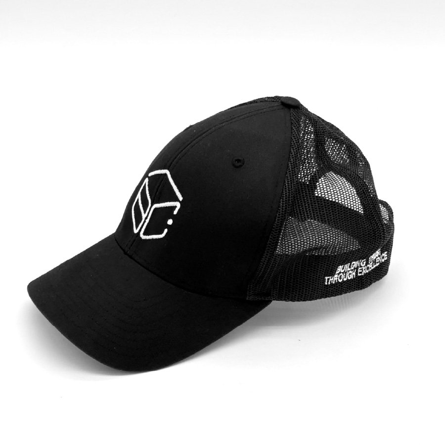
Applications for the logo and color palette included merchandise such as shirts and hats, business cards, and truck decals.
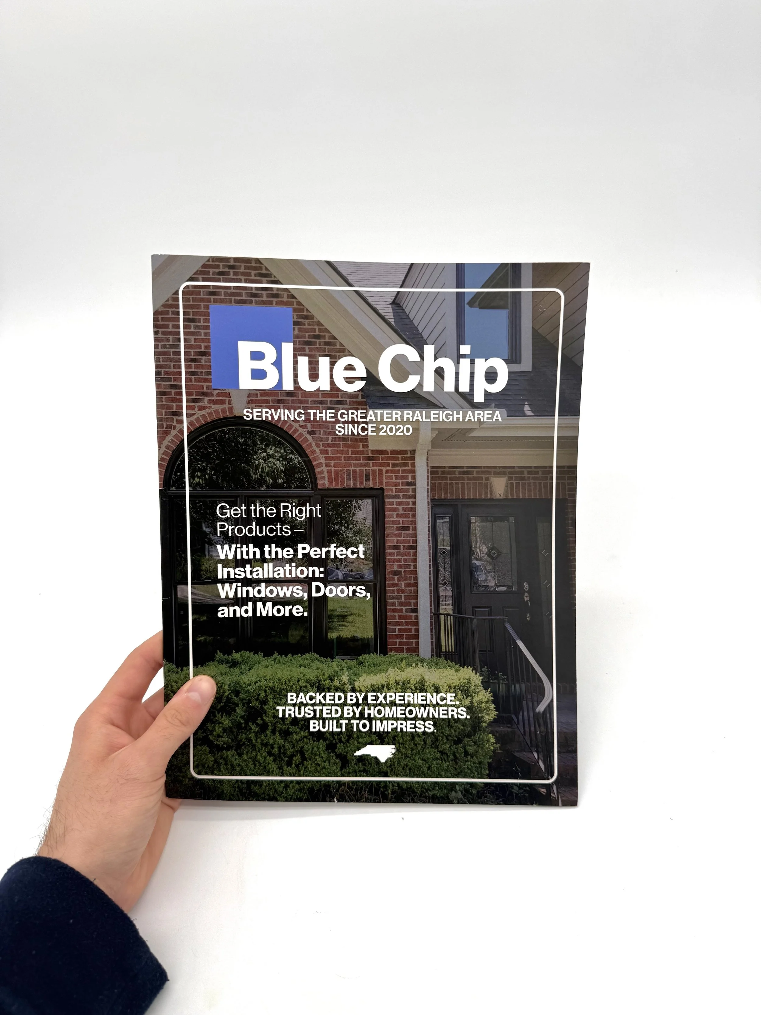
Pre-Sales Lookbook
The Approach
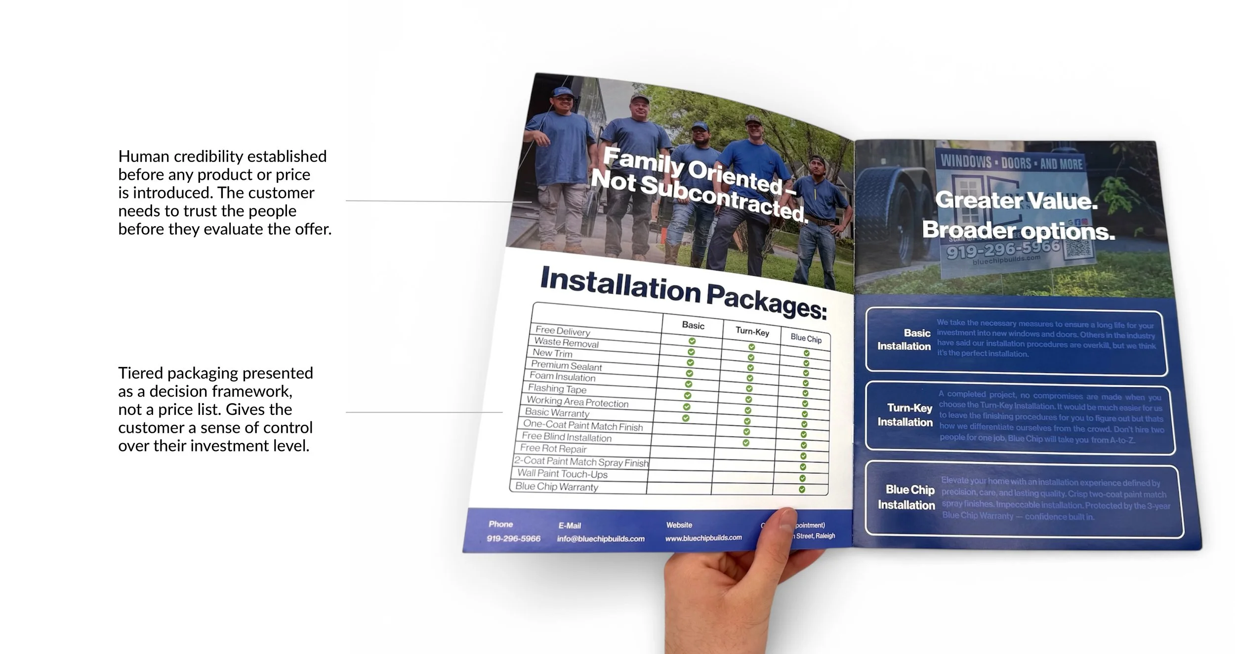
The central design decision was sequencing. Rather than leading with products or pricing, the lookbook opens by establishing who Blue Chip is: their team, their track record, and their values. From there, the content moves progressively from options and tiers, to process transparency, to social proof, and finally to closing credibility markers. Each spread was designed to answer the question a customer would naturally ask at that stage of the conversation, reducing anxiety incrementally rather than presenting everything at once.
The Solution
The lookbook is structured as a guided conversation rather than a catalog. Six key spreads carry the core UX load:
Each spread was designed to answer one question and create the conditions for the next.
The Outcome
The lookbook gave Blue Chip's sales process a physical form. Information that previously lived only in conversation, pricing tiers, warranties, installation process, contact details, was consolidated into a single live client consultation and leave-behind asset that customers could reference after the sales rep left the room. The sales experience went from invisible to documented, giving customers the clarity to make informed decisions on their own terms.
The pre-sales lookbook was designed to support live client consultations, as well as function as a leave-behind asset. A customer sitting down with a Blue Chip sales rep has already expressed interest, but they haven’t committed yet. They still have questions about cost, process, product quality, and whether Blue Chip is the right company for the job. The lookbook was built to answer those questions systematically, in the order a customer would naturally ask them, turning an unstructured sales conversation into a guided experience for the client.
The Customer
The customer sitting across from a Blue Chip sales rep has already decided they want new windows or doors. What they haven't decided is who to trust with that investment. Cost, quality, and warranty coverage are all concerns, and so is the more basic question of who Blue Chip actually is. The lookbook needed to answer those questions in order, before they were asked.
The Problem
Before the lookbook, Blue Chip's credibility lived outside the sales conversation, in Google reviews and word of mouth referrals. Once a rep was sitting with a potential customer, there was no structured tool to guide the discussion, establish trust, or walk the homeowner through their options systematically. The sales experience was undesigned.
01
The team introduction establishes human credibility before any product is shown.
02
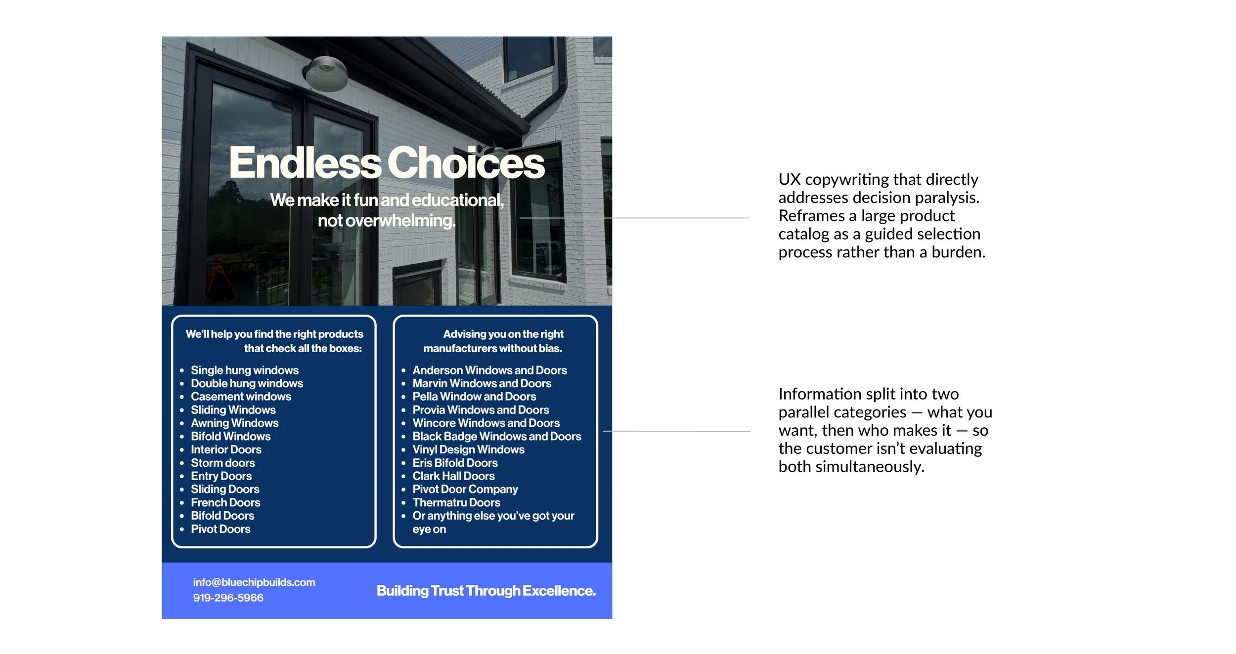
The options spread reframes an overwhelming selection as an educational experience.
03
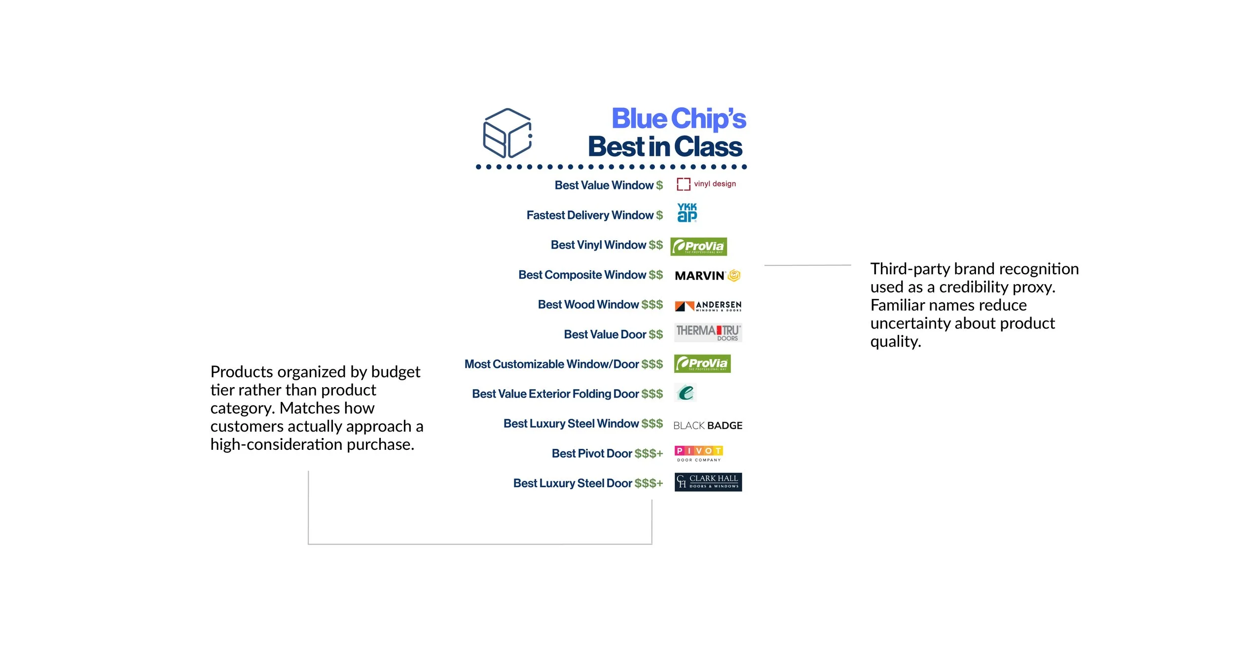
The Best in Class comparison organizes products by budget rather than category, matching how customers actually evaluate purchases.
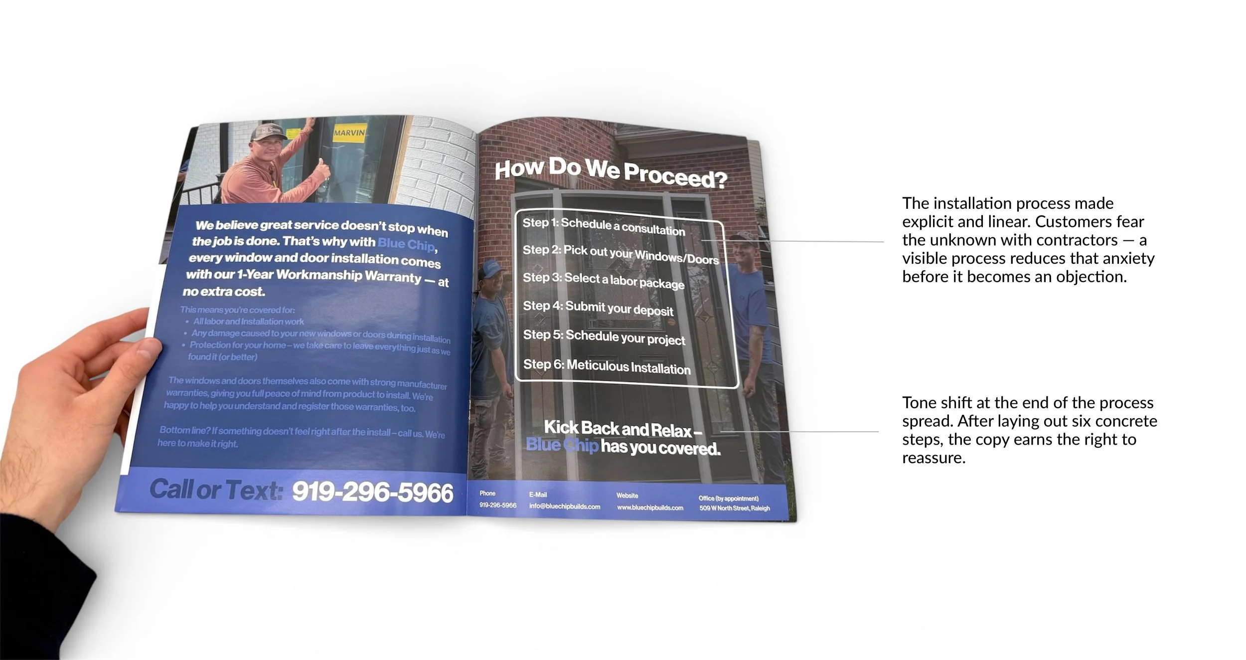
04
The process spread makes Blue Chip's installation steps explicit, reducing fear of the unknown.
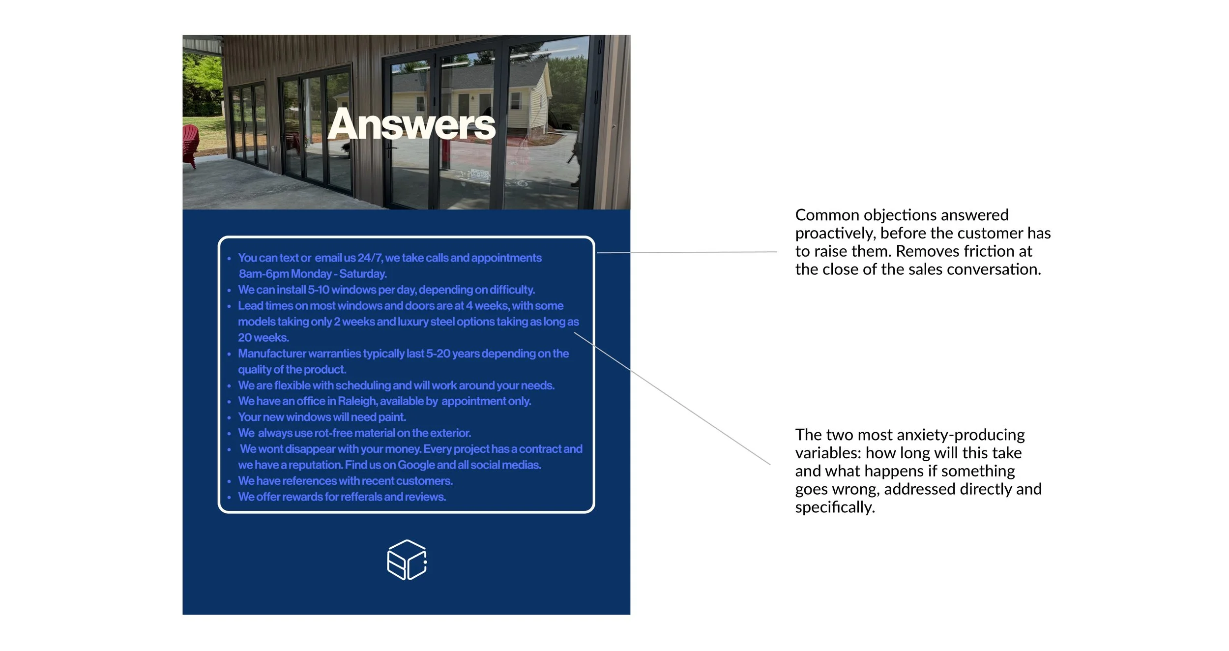
05
The FAQ addresses common objections before they surface.
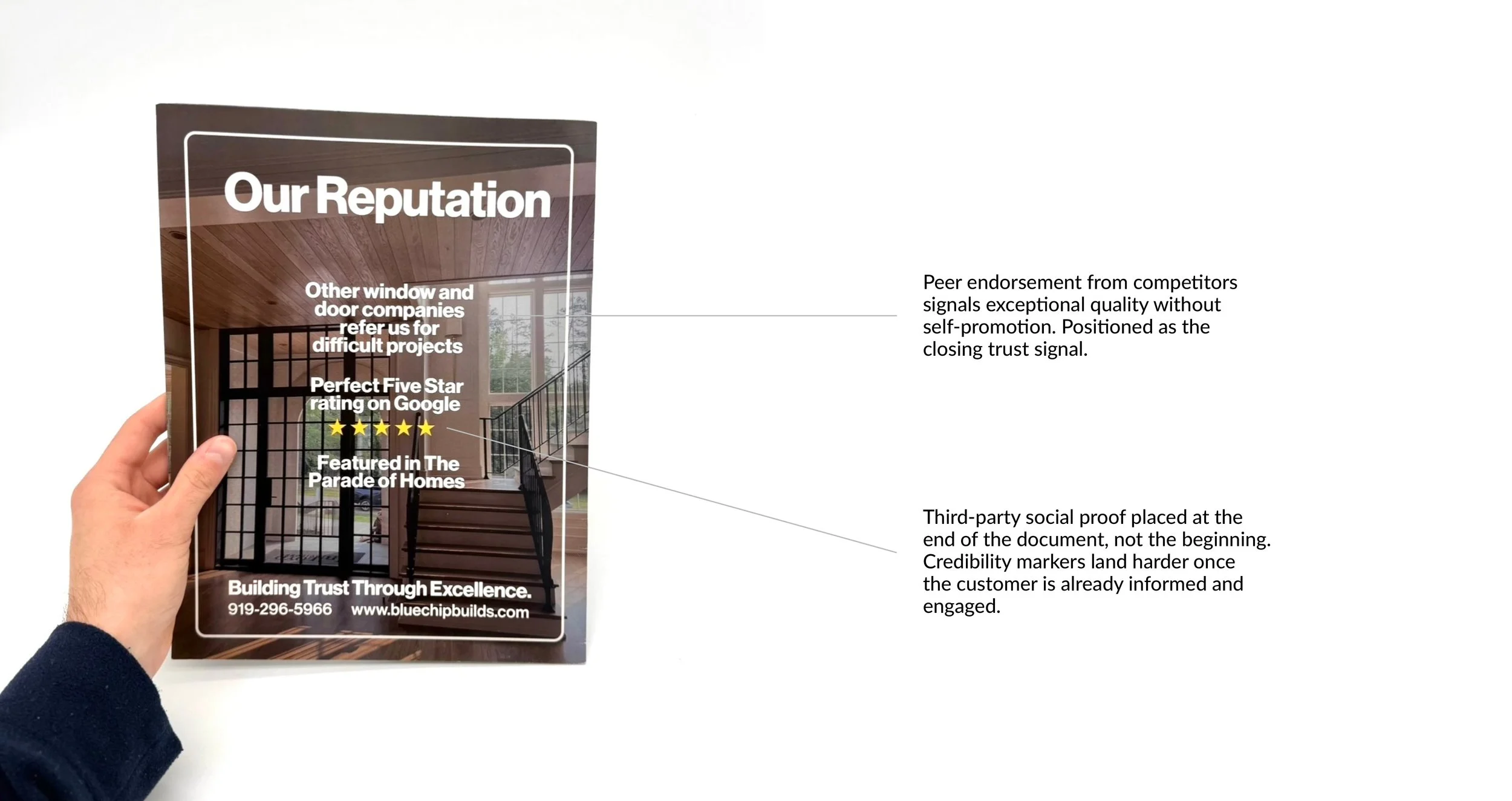
06
The reputation spread closes with third-party credibility markers once the customer is already engaged.